the publication is aimed at older generations who have missed the technology boom in a way that younger generations have not, because they have been born into and grown up with the tehcnology rise. since they have missed out and so do not understand the jargon to the same extent kids do, the publication aims at presenting a number of phrases in an aesthetically pleasing and traditional manor accompanied by a context and explanatory translation.
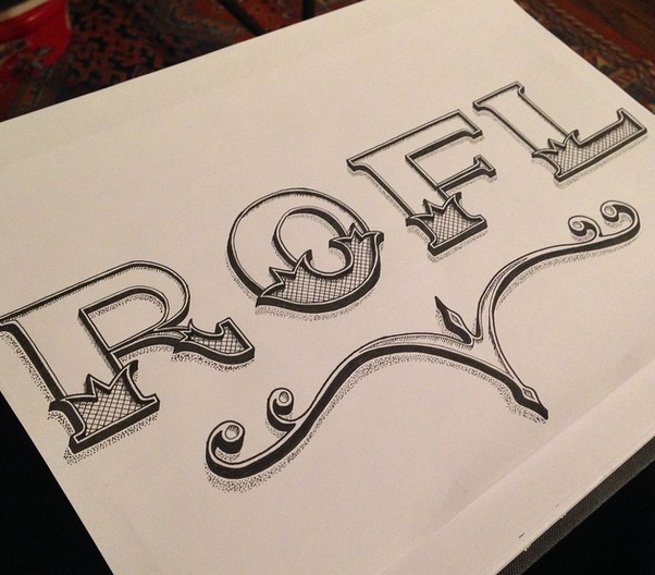
i began by hand drawing my chosen phrases typographically. i chose some often used phrases and some less known.
what you been up to

for the win

laugh out loud

rolling on the floor laughing
then i chose my stock. i decided to use gf smith card paper as it is robust and has a good feel to it.
i chose a combination of grey and yellow mounted together in a two tone overlay as the cover sheets.


i then used a reoccuring pattern of grey then red as the pages to house the typographic piece and then the tranlation and context piece respectively.


having chosen the stock i then measured out the fold accounting for creep and used a bonefold to fold each page to produce the spine ready for binding.


i then proceeded to mount the pages to the stock.


having prepared the pages i went on to design and produce the cover sheet. i chose to use a brown for contrast different to the existing colour scheme. i chose the title as a double entendre. i cut out the 'digitally' by hand and then designed the bottom half to marry up with the top.


from this i used a japanese saddle stitch binding method. i chose yellow thread to continue the colour scheme and present a contrast to the black.


i was pleased with the outcome and the fact that i had stuck to the 'hand - made' constraint. the book functioned well and worked as it hand intended.
in critique, i would have liked to have included a few more typographic phrases and translations to make the book a bit more extensive. due to my planning however i was unable to. there was a minor problem cropping the top and so the top of the pages sometimes creep past others but it is not highly noticeable and doesnt affect readability or presentation.
i also produced design boards.
No comments:
Post a Comment