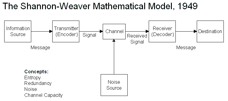
we tried to relate the design process to this model in groups talking about what each stage could be in design terms. having discussed and debated we each had slightly different opinions.
- information source - the client - provides designer with brief/spec i.e. information
- transmitter - the designer - recieves information and through self reinterprets it to form of communication
- channel - the product - the media/format of the design produced
- receiver - the audience - anyone who sees or comes in contact with the design
- destination - the target audience - the audience who is intended by the designer to see the design
- noise source - reasearch/understanding - how much the designer knows about the topic/aims
having discussed our theories as a class richard then went on to talk about there being 3 main levels of communication problems -
level a - technical problems; how accurately can a message be transmitted
level b - semantic problems; how precisely is the message conveyed
level c - effectiveness problems; how effectively do the recieved message and its meaning affect behaviour.
an example of each -
a - technical problems - the printer broke
b - semantic problems - the client gave a poor brief
c - effectiveness problems - the promotion of a club compared to its attendance levelsalthough not completely accurate and relatable the model does give a good basic illustration of the design process however the design process is never a linear one.
we then talked about what noise meant in design terms and what examples we could think of. richard made the point that noise is not always a negative like how zines being low cost means often there are errors in design/production but that these have now become a part of the zine aesthetic - offset print etc becomes communication in itself.
- redundancy vs entropy
redundancy is high predictability, low information, widely understood, the most basic.
entropy is unexpected, unpredictable, high info, less widely understood, more intricate.
in design redundancy is a desired thing because it usually means the most successful method/form of communication meaning the most effective design.
we were then given the task to analyse a piece of visual communication in line with the model and taking into consideration redundancy/entropy.
having looked at some peices of visual communication i decided to choose the promotional poster for the 2011 film 'Martha Marcy May Marlene'
richard asked us to consider some questions when writing our response to the task as a 'guidance' to our writing:
What are the main communicative functions of redundancy?
What are the ways in which convention can be said to facilitate understanding?
How does your chosen piece of visual communication break or extend specific conventions?
How does this effect the desire to communicate or the intended audience?

the information source (client) has relayed the themes of the film to the transmitter (designer) which he has translated into an appropriate channel (media/format) that is left to the receiver (audience) to decode.
The poster above is a promotional design for the film 'Martha Marcy May Marlene' designed by Jack Crossing of Empire Design. It uses photo layering accompanied by a soft, pastel aesthetic to give a seeming beauty and serenity while subtly implying a disturbing undertone. The grid style layout of the sans-serif text co-exists well with the theme of the poster as it remains neutral and so doesn't affect how the poster is otherwise interpreted. The themes of uncertainty and danger masqueraded by the calm and uplifting beginnings are fantastically visualised through the overlapping photographs of Marcy and the dark stranger in the background. The sun glare and the desaturated colour both communicate placidity yet her facial expressions and the macro style focus suggest otherwise. The form of a poster is appropriate to the reason for the design (film promotion) and, furthermore, when seen printed, extends the look and texture of the design in line with its communicative aims. On the surface, the design's aesthetic is very simple and easily absorbed. It's clean, inoffensive and generally aesthetically pleasing but, on a deeper level, the redundancy of the design is questionable. a film poster, in its most basic justification, should communicate to the target audience what the film is about. This poster, a good example of entropic design, does not really follow convention in its aims as the methods through which the designer is trying to communicate are cryptic and require greater analysis to understand. The poster, to an extent, is contradictory in its purpose and execution because, to truly understand the poster and relate it to the film, you have to watch the film and this, somewhat, lessens its promotional value. Inversely, the design could be interpreted as purposefully misleading to the audience or promoting a false sense of security about the film which would be wholly appropriate because this is the point of the film itself. The design and its methods of communicating the film break away from typical promotional conventions in that it is very mysterious and doesn't really tell the audience much. Instead, it follows more contemporary and progressive methods in targeting peoples curiosity and desire to learn, especially when presented with something they don't understand or know about. This could be considered a risky method because it relies on the assumption that the audience is curious enough to do further research which should, in turn, interest them more in the film. With the common ownership of smart technology and near global access to the internet, however, this is a much safer assumption and is really appropriate to a 21st century audience who are likely to engage with the promotion more-so. I think the poster is a fantastically executed and considered piece of promotion that relates so perfectly to the themes of the film and its intended audience and that appropriately excludes those outside that target market.
No comments:
Post a Comment