ALPHABET SOUP...
DISSECT.
c.1600. From the Latin 'Dissecare' - "To cut asunder, cut up".
Dis = Asunder Secare = to Cut.
Dissection (also called anatomization) is usually the process of disassembling and observing something to determine its internal structure and as an aid to discerning the functions and relationships of its components.

dis·sect/diˈsekt/
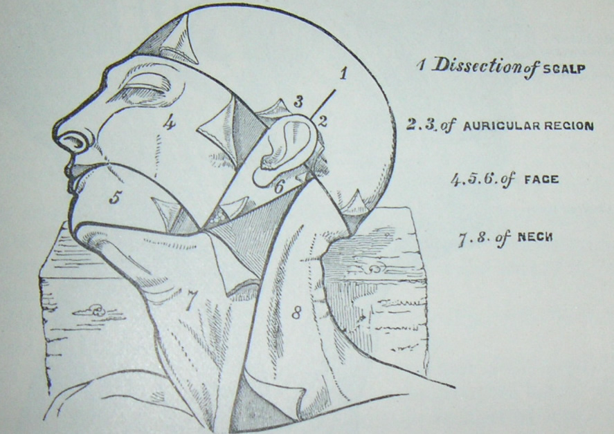
although a, somewhat, gruesome image, the above picture was important for me to
understand the medical aspect of dissection. the dissection of a body to observe and
analyse its structural makeup and the ways in which a body works are important in giving
us an understanding of the living anatomy. in this way, i wanted to investigate and, hence,
understand the structural anatomy of typography and letterforms.
dis·sect/diˈsekt/
although a, somewhat, gruesome image, the above picture was important for me to
understand the medical aspect of dissection. the dissection of a body to observe and
analyse its structural makeup and the ways in which a body works are important in giving
us an understanding of the living anatomy. in this way, i wanted to investigate and, hence,
understand the structural anatomy of typography and letterforms.| Verb: |
|

Dissection can and does only exist/occur because of a subject having 'parts' or
separable sections of its structure or make-up.
In the same respect, letters and typography is heavily
concerned with the 'parts' that make up a letterform.

Each letter is made up of parts, much like the human body. The
structure of letters is somewhat like that of scaffolding; the main
body (poles and supports) is held together by smaller parts
(vices and clamps). With a letter the Stems and Spines
are held together by Arcs, Shoulders and Crossbars.

Having looked at some blueprints/directional maps of common dissections
I thought about applying this theme to a letter. Make it a 'medical' process.
ANDREAS SCHEIGER - DISSECTED TYPOGRAPHY


Scheiger's letterforms are a great example of how letters can be dissected
and inspected. I think the attention to detail is incredible and his consideration
and inspected. I think the attention to detail is incredible and his consideration
of form and precision is in depth. he has managed to truly make typography a
medical process.
medical process.

i decided that serif fonts are most representative of a bodily form.
they maintain the main structure of a letter (the stems and strokes) but then,
because of the serifs, mimic a fuller human body. the serifs are like the
extremities of each letterform and in this way are appropriate.
they maintain the main structure of a letter (the stems and strokes) but then,
because of the serifs, mimic a fuller human body. the serifs are like the
extremities of each letterform and in this way are appropriate.
i thought the most interesting font i came across was MONGOLIAN BALTI.
i really like the differences in weights in terms of stems and crossbars
and how the serifs have a curved join to the main letter. that aspect,
i think, will be a real strong point in terms what i can physically dissect.
i really like the differences in weights in terms of stems and crossbars
and how the serifs have a curved join to the main letter. that aspect,
i think, will be a real strong point in terms what i can physically dissect.

my decision to use this typeface was then transferred to my practice.
i performed the 'dissection on each letter and this can be seen on my
design practice blog.
i performed the 'dissection on each letter and this can be seen on my
design practice blog.


